Fitting Exercise

Introduction

We will explore and analyze data for the drug candidate Mavoglurant. These data were generated by the Metrum Research Group and can be accessed on Github through the following link: https://github.com/metrumresearchgroup/BayesPBPK-tutorial

Load and clean the data

# Load packages.
library(tidyverse)
── Attaching core tidyverse packages ──────────────────────── tidyverse 2.0.0 ──
✔ dplyr     1.1.4     ✔ readr     2.1.6
✔ forcats   1.0.1     ✔ stringr   1.6.0
✔ ggplot2   4.0.1     ✔ tibble    3.3.1
✔ lubridate 1.9.4     ✔ tidyr     1.3.2
✔ purrr     1.2.1     
── Conflicts ────────────────────────────────────────── tidyverse_conflicts() ──
✖ dplyr::filter() masks stats::filter()
✖ dplyr::lag()    masks stats::lag()
ℹ Use the conflicted package (<http://conflicted.r-lib.org/>) to force all conflicts to become errors
library(tidymodels)
── Attaching packages ────────────────────────────────────── tidymodels 1.4.1 ──
✔ broom        1.0.12     ✔ rsample      1.3.2 
✔ dials        1.4.2      ✔ tailor       0.1.0 
✔ infer        1.1.0      ✔ tune         2.0.1 
✔ modeldata    1.5.1      ✔ workflows    1.3.0 
✔ parsnip      1.4.1      ✔ workflowsets 1.1.1 
✔ recipes      1.3.1      ✔ yardstick    1.3.2 
── Conflicts ───────────────────────────────────────── tidymodels_conflicts() ──
✖ scales::discard() masks purrr::discard()
✖ dplyr::filter()   masks stats::filter()
✖ recipes::fixed()  masks stringr::fixed()
✖ dplyr::lag()      masks stats::lag()
✖ yardstick::spec() masks readr::spec()
✖ recipes::step()   masks stats::step()
library(dplyr)
library(ggplot2)
library(here)
here() starts at C:/Users/aniss/Desktop/anissawallerdelvalle-portfolio
# Load the data and inspect.
data <- read_csv(here("fitting-exercise","Mavoglurant_A2121_nmpk.csv"))
Rows: 2678 Columns: 17
── Column specification ────────────────────────────────────────────────────────
Delimiter: ","
dbl (17): ID, CMT, EVID, EVI2, MDV, DV, LNDV, AMT, TIME, DOSE, OCC, RATE, AG...

ℹ Use `spec()` to retrieve the full column specification for this data.
ℹ Specify the column types or set `show_col_types = FALSE` to quiet this message.
glimpse(data)
Rows: 2,678
Columns: 17
$ ID   <dbl> 793, 793, 793, 793, 793, 793, 793, 793, 793, 793, 793, 793, 793, …
$ CMT  <dbl> 1, 2, 2, 2, 2, 2, 2, 2, 2, 2, 2, 2, 2, 2, 2, 2, 1, 2, 2, 2, 2, 2,…
$ EVID <dbl> 1, 0, 0, 0, 0, 0, 0, 0, 0, 0, 0, 0, 0, 0, 0, 0, 1, 0, 0, 0, 0, 0,…
$ EVI2 <dbl> 1, 0, 0, 0, 0, 0, 0, 0, 0, 0, 0, 0, 0, 0, 0, 0, 1, 0, 0, 0, 0, 0,…
$ MDV  <dbl> 1, 0, 0, 0, 0, 0, 0, 0, 0, 0, 0, 0, 0, 0, 0, 0, 1, 0, 0, 0, 0, 0,…
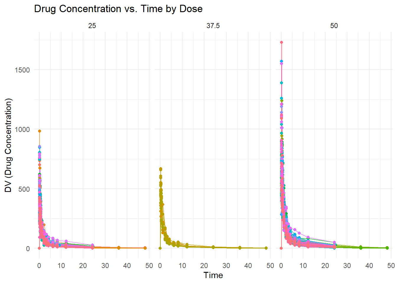
$ DV   <dbl> 0.00, 491.00, 605.00, 556.00, 310.00, 237.00, 147.00, 101.00, 72.…
$ LNDV <dbl> 0.000, 6.196, 6.405, 6.321, 5.737, 5.468, 4.990, 4.615, 4.282, 3.…
$ AMT  <dbl> 25, 0, 0, 0, 0, 0, 0, 0, 0, 0, 0, 0, 0, 0, 0, 0, 25, 0, 0, 0, 0, …
$ TIME <dbl> 0.000, 0.200, 0.250, 0.367, 0.533, 0.700, 1.200, 2.200, 3.200, 4.…
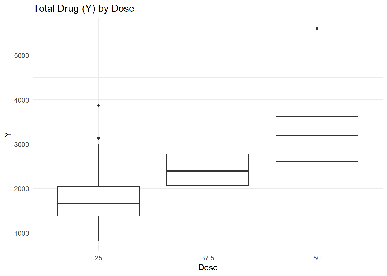
$ DOSE <dbl> 25, 25, 25, 25, 25, 25, 25, 25, 25, 25, 25, 25, 25, 25, 25, 25, 2…
$ OCC  <dbl> 1, 1, 1, 1, 1, 1, 1, 1, 1, 1, 1, 1, 1, 1, 1, 1, 1, 1, 1, 1, 1, 1,…
$ RATE <dbl> 75, 0, 0, 0, 0, 0, 0, 0, 0, 0, 0, 0, 0, 0, 0, 0, 150, 0, 0, 0, 0,…
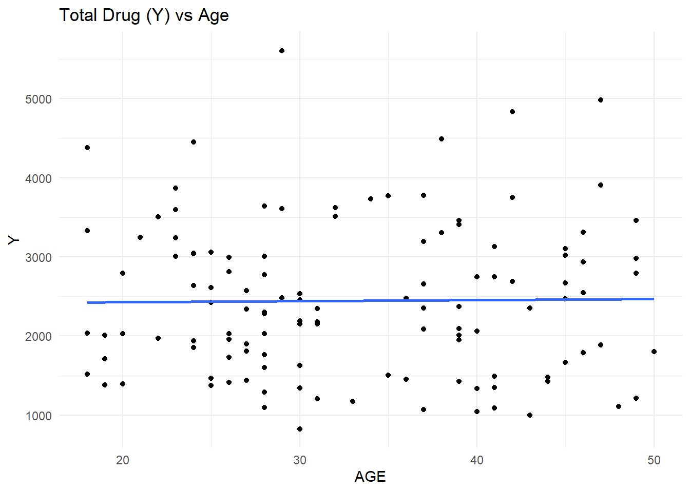
$ AGE  <dbl> 42, 42, 42, 42, 42, 42, 42, 42, 42, 42, 42, 42, 42, 42, 42, 42, 2…
$ SEX  <dbl> 1, 1, 1, 1, 1, 1, 1, 1, 1, 1, 1, 1, 1, 1, 1, 1, 1, 1, 1, 1, 1, 1,…
$ RACE <dbl> 2, 2, 2, 2, 2, 2, 2, 2, 2, 2, 2, 2, 2, 2, 2, 2, 2, 2, 2, 2, 2, 2,…
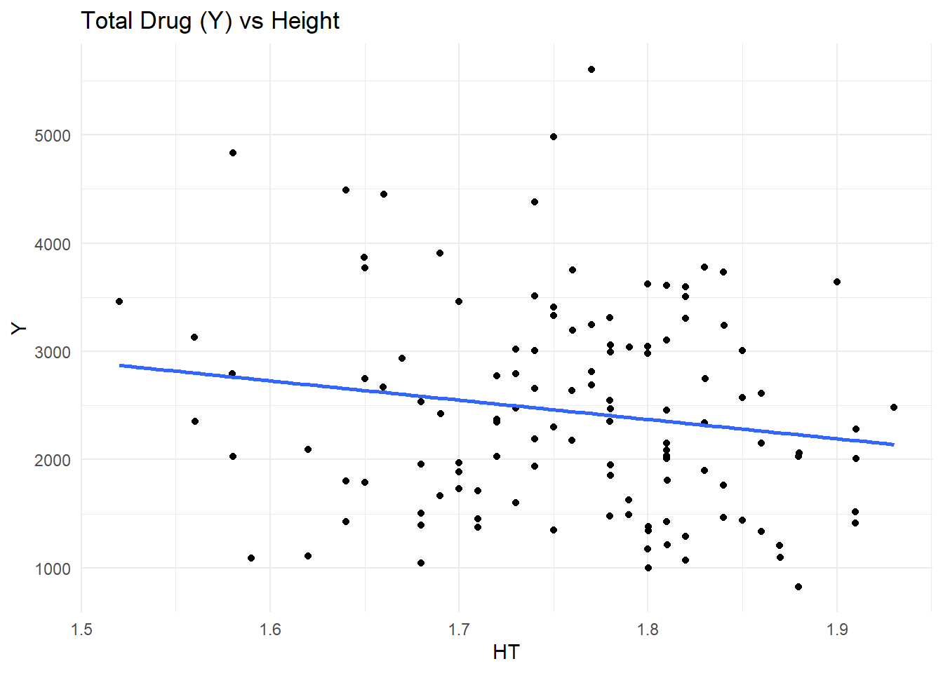
$ WT   <dbl> 94.3, 94.3, 94.3, 94.3, 94.3, 94.3, 94.3, 94.3, 94.3, 94.3, 94.3,…
$ HT   <dbl> 1.769997, 1.769997, 1.769997, 1.769997, 1.769997, 1.769997, 1.769…
# Plot DV vs Time. Stratify by dose. 
ggplot(data, aes(x = TIME, y = DV, group = ID, color = factor(ID))) + # color by id 
    geom_line(alpha = 0.7) + 
    geom_point() + 
    facet_wrap(~ DOSE) + # stratified panels by dose 
    labs(
        title = "Drug Concentration vs. Time by Dose",
        x = "Time", 
        y = "DV (Drug Concentration)"
    ) + 
    theme_minimal() + 
    theme(legend.position = "none") # remove legend 

# Keep only observations with OCC = 1 

data_occ1 <- data %>%
    filter(OCC == 1)

table(data_occ1$OCC)

   1 
1665 
# Create a data frame that contains obly observations were TIME == 0. 
baseline_data <- data_occ1 %>%
    filter(TIME == 0)
dim(baseline_data)
[1] 120  17
# Exclude observations with TIME = 0 and compute the sum of the DV cariable for each individual drug. Call this variable Y.

y_data <- data_occ1 %>%
    filter(TIME != 0) %>%
    group_by(ID) %>%
    summarize(Y = sum(DV, na.rm = TRUE))

dim(y_data)
[1] 120   2
# Join the data sets and examine.
combined_data <- baseline_data %>%
    left_join(y_data, by = "ID") # adds Y to each subject while preserving the baseline rows 
dim(combined_data)
[1] 120  18
glimpse(combined_data)
Rows: 120
Columns: 18
$ ID   <dbl> 793, 794, 795, 796, 797, 798, 799, 800, 801, 802, 803, 804, 805, …
$ CMT  <dbl> 1, 1, 1, 1, 1, 1, 1, 1, 1, 1, 1, 1, 1, 1, 1, 1, 1, 1, 1, 1, 1, 1,…
$ EVID <dbl> 1, 1, 1, 1, 1, 1, 1, 1, 1, 1, 1, 1, 1, 1, 1, 1, 1, 1, 1, 1, 1, 1,…
$ EVI2 <dbl> 1, 1, 1, 1, 1, 1, 1, 1, 1, 1, 1, 1, 1, 1, 1, 1, 1, 1, 1, 1, 1, 1,…
$ MDV  <dbl> 1, 1, 1, 1, 1, 1, 1, 1, 1, 1, 1, 1, 1, 1, 1, 1, 1, 1, 1, 1, 1, 1,…
$ DV   <dbl> 0, 0, 0, 0, 0, 0, 0, 0, 0, 0, 0, 0, 0, 0, 0, 0, 0, 0, 0, 0, 0, 0,…
$ LNDV <dbl> 0, 0, 0, 0, 0, 0, 0, 0, 0, 0, 0, 0, 0, 0, 0, 0, 0, 0, 0, 0, 0, 0,…
$ AMT  <dbl> 25.0, 25.0, 25.0, 25.0, 25.0, 25.0, 25.0, 25.0, 25.0, 25.0, 25.0,…
$ TIME <dbl> 0, 0, 0, 0, 0, 0, 0, 0, 0, 0, 0, 0, 0, 0, 0, 0, 0, 0, 0, 0, 0, 0,…
$ DOSE <dbl> 25.0, 25.0, 25.0, 25.0, 25.0, 25.0, 25.0, 25.0, 25.0, 25.0, 25.0,…
$ OCC  <dbl> 1, 1, 1, 1, 1, 1, 1, 1, 1, 1, 1, 1, 1, 1, 1, 1, 1, 1, 1, 1, 1, 1,…
$ RATE <dbl> 75, 150, 150, 150, 150, 150, 150, 150, 150, 150, 150, 150, 225, 2…
$ AGE  <dbl> 42, 24, 31, 46, 41, 27, 23, 20, 23, 28, 46, 22, 43, 50, 19, 26, 3…
$ SEX  <dbl> 1, 1, 1, 2, 2, 1, 1, 1, 1, 1, 1, 1, 2, 2, 1, 1, 1, 1, 1, 1, 1, 1,…
$ RACE <dbl> 2, 2, 1, 1, 2, 2, 1, 88, 2, 1, 1, 1, 1, 1, 2, 2, 1, 1, 1, 1, 1, 1…
$ WT   <dbl> 94.3, 80.4, 71.8, 77.4, 64.3, 74.1, 87.9, 61.9, 65.3, 103.5, 83.0…
$ HT   <dbl> 1.769997, 1.759850, 1.809847, 1.649993, 1.560052, 1.829862, 1.850…
$ Y    <dbl> 2690.52, 2638.81, 2149.61, 1788.89, 3126.37, 2336.89, 3007.20, 27…
# Convert RACE and SEX to factors. Keep only Y, dose, age, sex, race, wt, and ht.

model_data <- combined_data %>%
    mutate(
        RACE = factor(RACE),
        SEX = factor(SEX)
    ) %>%
    select (Y, DOSE, AGE, SEX, RACE, WT, HT)

glimpse(model_data)
Rows: 120
Columns: 7
$ Y    <dbl> 2690.52, 2638.81, 2149.61, 1788.89, 3126.37, 2336.89, 3007.20, 27…
$ DOSE <dbl> 25.0, 25.0, 25.0, 25.0, 25.0, 25.0, 25.0, 25.0, 25.0, 25.0, 25.0,…
$ AGE  <dbl> 42, 24, 31, 46, 41, 27, 23, 20, 23, 28, 46, 22, 43, 50, 19, 26, 3…
$ SEX  <fct> 1, 1, 1, 2, 2, 1, 1, 1, 1, 1, 1, 1, 2, 2, 1, 1, 1, 1, 1, 1, 1, 1,…
$ RACE <fct> 2, 2, 1, 1, 2, 2, 1, 88, 2, 1, 1, 1, 1, 1, 2, 2, 1, 1, 1, 1, 1, 1…
$ WT   <dbl> 94.3, 80.4, 71.8, 77.4, 64.3, 74.1, 87.9, 61.9, 65.3, 103.5, 83.0…
$ HT   <dbl> 1.769997, 1.759850, 1.809847, 1.649993, 1.560052, 1.829862, 1.850…
# Save the cleaned dataset (with SEX included) as an RDS file
saveRDS(model_data, file = here("ml-models-exercise", "model_data.rds"))

Exploratory Data Analysis

# Check counts for categorical variables
model_data %>%
    count(SEX)
# A tibble: 2 × 2
  SEX       n
  <fct> <int>
1 1       104
2 2        16
model_data %>%
    count(RACE)
# A tibble: 4 × 2
  RACE      n
  <fct> <int>
1 1        74
2 2        36
3 7         2
4 88        8
model_data %>%
    count(DOSE)
# A tibble: 3 × 2
   DOSE     n
  <dbl> <int>
1  25      59
2  37.5    12
3  50      49
# Obtain summary statistics.
summary(model_data)
       Y               DOSE            AGE        SEX     RACE   
 Min.   : 826.4   Min.   :25.00   Min.   :18.00   1:104   1 :74  
 1st Qu.:1700.5   1st Qu.:25.00   1st Qu.:26.00   2: 16   2 :36  
 Median :2349.1   Median :37.50   Median :31.00           7 : 2  
 Mean   :2445.4   Mean   :36.46   Mean   :33.00           88: 8  
 3rd Qu.:3050.2   3rd Qu.:50.00   3rd Qu.:40.25                  
 Max.   :5606.6   Max.   :50.00   Max.   :50.00                  
       WT               HT       
 Min.   : 56.60   Min.   :1.520  
 1st Qu.: 73.17   1st Qu.:1.700  
 Median : 82.10   Median :1.770  
 Mean   : 82.55   Mean   :1.759  
 3rd Qu.: 90.10   3rd Qu.:1.813  
 Max.   :115.30   Max.   :1.930  
# Obtain a more detailed summary 
model_data %>%
    summarise(
        mean_Y = mean(Y),
        sd_Y = sd(Y),
        mean_age = mean(AGE),
        mean_wt = mean(WT),
        mean_ht = mean(HT)
    )
# A tibble: 1 × 5
  mean_Y  sd_Y mean_age mean_wt mean_ht
   <dbl> <dbl>    <dbl>   <dbl>   <dbl>
1  2445.  962.       33    82.6    1.76
# From this, we see that the outcome variable Y shows variabilty across individuals. These individuals were aged between 18 and 50, with predictors such as age, weight, and height appearing within normal adult ranges. 
# Explore the relationship between Y and the predictors. n

# Age
ggplot(model_data, aes(x = AGE, y = Y)) +
  geom_point() +
  geom_smooth(method = "lm", se = FALSE) +
  labs(title = "Total Drug (Y) vs Age") +
  theme_minimal()
`geom_smooth()` using formula = 'y ~ x'

# Dose. Visualize with a box plot, as it is categorical. 
ggplot(model_data, aes(x = factor(DOSE), y = Y)) +
  geom_boxplot() +
  labs(title = "Total Drug (Y) by Dose", x = "Dose") +
  theme_minimal()

# Height 
ggplot(model_data, aes(x = HT, y = Y)) +
  geom_point() +
  geom_smooth(method = "lm", se = FALSE) +
  labs(title = "Total Drug (Y) vs Height") +
  theme_minimal()
`geom_smooth()` using formula = 'y ~ x'

# Race. Visualize with a box plot, as it is categorical. 
ggplot(model_data, aes(x = RACE, y = Y)) +
  geom_boxplot() +
  labs(title = "Total Drug (Y) by Race") +
  theme_minimal()

# Sex. Visualize with a box plot, as it is categorical. 
ggplot(model_data, aes(x = SEX, y = Y)) +
  geom_boxplot() +
  labs(title = "Total Drug (Y) by Sex") +
  theme_minimal()

# Weight 
ggplot(model_data, aes(x = WT, y = Y)) +
  geom_point() +
  geom_smooth(method = "lm", se = FALSE) +
  labs(title = "Total Drug (Y) vs Weight") +
  theme_minimal()
`geom_smooth()` using formula = 'y ~ x'

# No strong linear relationships between Y and most predictors. The exception is dose, which suggests an increase in total drug exposure with higher doses (as expected).
# View the distribution of variables to determine if there are any outliers. 

# Age
ggplot(model_data, aes(x = AGE)) +
  geom_histogram(bins = 20) +
  labs(title = "Age Distribution") +
  theme_minimal()

# Height 
ggplot(model_data, aes(x = HT)) +
  geom_histogram(bins = 20) +
  labs(title = "Height Distribution") +
  theme_minimal()

# Weight 
ggplot(model_data, aes(x = WT)) +
  geom_histogram(bins = 20) +
  labs(title = "Weight Distribution") +
  theme_minimal()

# Y 
ggplot(model_data, aes(x = Y)) +
  geom_histogram(bins = 30) +
  labs(title = "Distribution of Total Drug (Y)") +
  theme_minimal()

# No obvious, exxtreme outliers are visible. 

Model Fitting

# Fit a linear model where Y is predicted by dose

lm_dose <- linear_reg() %>%
  set_engine("lm") %>%
  fit(Y ~ DOSE, data = model_data)

lm_dose_preds <- predict(lm_dose, model_data) %>%
  bind_cols(model_data)

metrics(lm_dose_preds, truth = Y, estimate = .pred)
# A tibble: 3 × 3
  .metric .estimator .estimate
  <chr>   <chr>          <dbl>
1 rmse    standard     666.   
2 rsq     standard       0.516
3 mae     standard     517.   
# Fit a linear model to Y using all predictors 

lm_full <- linear_reg() %>%
  set_engine("lm") %>%
  fit(Y ~ DOSE + AGE + SEX + RACE + WT + HT, data = model_data)

lm_full_preds <- predict(lm_full, model_data) %>%
  bind_cols(model_data)

metrics(lm_full_preds, truth = Y, estimate = .pred)
# A tibble: 3 × 3
  .metric .estimator .estimate
  <chr>   <chr>          <dbl>
1 rmse    standard     591.   
2 rsq     standard       0.619
3 mae     standard     444.   
# These data indicate that there is a moderate relationship between dose and drug exposure. The R squared value indicates that dose alone explains >50% of the variability, while the RMSE of 666 indicates that the model's prediction deviate from the observed values by 666 units on average. 
# Repeat the above, now considering sex as the outcome. 

# First, confirm that sex is a binary factor. 
model_data$SEX <- factor(model_data$SEX)

# Sex predicted by dose. 
log_dose <- logistic_reg() %>%
  set_engine("glm") %>%
  fit(SEX ~ DOSE, data = model_data)

log_dose_preds <- predict(log_dose, model_data, type = "prob") %>%
  bind_cols(predict(log_dose, model_data)) %>%
  bind_cols(model_data)

metrics(log_dose_preds, truth = SEX, estimate = .pred_class)
# A tibble: 2 × 3
  .metric  .estimator .estimate
  <chr>    <chr>          <dbl>
1 accuracy binary         0.867
2 kap      binary         0    
roc_auc(log_dose_preds, truth = SEX, .pred_1)
# A tibble: 1 × 3
  .metric .estimator .estimate
  <chr>   <chr>          <dbl>
1 roc_auc binary         0.592
# These data indicate that dose alone does not predict sex. The Kappa statistic is 0, meaning that the model is not better than random guessing, and the ROC-AUC is 0.592, which indicates poor discriminatory ability / random classification. 

# Sex predicted by all predictors. 
log_full <- logistic_reg() %>%
  set_engine("glm") %>%
  fit(SEX ~ DOSE + AGE + RACE + WT + HT, data = model_data)

log_full_preds <- predict(log_full, model_data, type = "prob") %>%
  bind_cols(predict(log_full, model_data)) %>%
  bind_cols(model_data)

metrics(log_full_preds, truth = SEX, estimate = .pred_class)
# A tibble: 2 × 3
  .metric  .estimator .estimate
  <chr>    <chr>          <dbl>
1 accuracy binary         0.942
2 kap      binary         0.741
roc_auc(log_full_preds, truth = SEX, .pred_1)
# A tibble: 1 × 3
  .metric .estimator .estimate
  <chr>   <chr>          <dbl>
1 roc_auc binary         0.975
# These data indicate that variables such as weight and sex are correlated with sex. The Kappa value is 0.741 and the ROC-AUC is 0.975, indicating good model discrimination. 

Module 10 Introduction

Module 10 is centered aroung improving models. Below is the exercise for Module 10. Make sure you run all scripts provided above.

Load packages and data.

library(tidyverse)
library(tidymodels)
library(here)
library(dplyr)
library(ggplot2)

# Set random seed. 
rngseed <- 1234

# Load and prep data. 
data <- read_csv(here("fitting-exercise","Mavoglurant_A2121_nmpk.csv"))
Rows: 2678 Columns: 17
── Column specification ────────────────────────────────────────────────────────
Delimiter: ","
dbl (17): ID, CMT, EVID, EVI2, MDV, DV, LNDV, AMT, TIME, DOSE, OCC, RATE, AG...

ℹ Use `spec()` to retrieve the full column specification for this data.
ℹ Specify the column types or set `show_col_types = FALSE` to quiet this message.
# Keep OCC = 1
data_occ1 <- data %>%
  filter(OCC == 1)

# Baseline (TIME = 0)
baseline_data <- data_occ1 %>%
  filter(TIME == 0)

# Compute Y (sum of DV excluding TIME = 0)
y_data <- data_occ1 %>%
  filter(TIME != 0) %>%
  group_by(ID) %>%
  summarize(Y = sum(DV, na.rm = TRUE))

# Merge
combined_data <- baseline_data %>%
  left_join(y_data, by = "ID")

# Obtain final modeling dataset. Note that RACE is removed as per the instructions. 
model_data <- combined_data %>%
  mutate(SEX = factor(SEX)) %>%
  select(Y, DOSE, AGE, SEX, WT, HT)

# Train and test. 
set.seed(rngseed)

data_split <- initial_split(model_data, prop = 0.75)
train_data <- training(data_split)
test_data  <- testing(data_split)

Model Fitting

# Model 1: DOSE only
model1 <- linear_reg() %>%
  set_engine("lm") %>%
  fit(Y ~ DOSE, data = train_data)

# Model 2: All predictors
model2 <- linear_reg() %>%
  set_engine("lm") %>%
  fit(Y ~ DOSE + AGE + SEX + WT + HT, data = train_data)

# Predictions
pred1 <- predict(model1, train_data) %>%
  bind_cols(train_data)

pred2 <- predict(model2, train_data) %>%
  bind_cols(train_data)

# RMSE for models
rmse_model1 <- rmse(pred1, truth = Y, estimate = .pred)
rmse_model2 <- rmse(pred2, truth = Y, estimate = .pred)

# Null model (mean prediction)
mean_y <- mean(train_data$Y)
rmse_null <- sqrt(mean((train_data$Y - mean_y)^2))

# Print results
rmse_null
[1] 948.3526
rmse_model1
# A tibble: 1 × 3
  .metric .estimator .estimate
  <chr>   <chr>          <dbl>
1 rmse    standard        703.
rmse_model2
# A tibble: 1 × 3
  .metric .estimator .estimate
  <chr>   <chr>          <dbl>
1 rmse    standard        627.
  • The RMSE of the null model is 948.
  • The RMSE of Model 1 is 703.
  • The RMSE of Model 2 is 627.

The lower the RMSE, the better the prediction. * The null model assumes that there is no dose-response relationship (i.e., everyone has the same exposure). * Model 1 suggests that dose is the main driver behind drug exposure. * Model 2 suggests that covariates (age, sex, weight, height) have moderate affect on exposure. The dosage is the main driver, but these patient factors explain residual variability. This has the lowest RMSE value and is currently the best model.

Cross Validation

set.seed(rngseed)

folds <- vfold_cv(train_data, v = 10)

# Model 1 CV
model1_cv <- fit_resamples(
  linear_reg() %>% set_engine("lm"),
  Y ~ DOSE,
  resamples = folds,
  metrics = metric_set(rmse)
)

# Model 2 CV
model2_cv <- fit_resamples(
  linear_reg() %>% set_engine("lm"),
  Y ~ DOSE + AGE + SEX + WT + HT,
  resamples = folds,
  metrics = metric_set(rmse)
)

# Collect CV results
cv_results_model1 <- collect_metrics(model1_cv)
cv_results_model2 <- collect_metrics(model2_cv)

cv_results_model1
# A tibble: 1 × 6
  .metric .estimator  mean     n std_err .config        
  <chr>   <chr>      <dbl> <int>   <dbl> <chr>          
1 rmse    standard    691.    10    67.5 pre0_mod0_post0
cv_results_model2
# A tibble: 1 × 6
  .metric .estimator  mean     n std_err .config        
  <chr>   <chr>      <dbl> <int>   <dbl> <chr>          
1 rmse    standard    646.    10    64.8 pre0_mod0_post0

This section added by Emil Joson

Part 2 - Model Predictions

# Create predictions for the null model.
# The null model predicts the same mean Y value for every subject.
null_pred <- tibble(
  Y = train_data$Y,                    # observed outcome
  .pred = mean_y,                      # same predicted value for all rows
  model = "Null model"                 # label for the model
)

# Create predictions for Model 1 (DOSE only).
model1_pred <- predict(model1, train_data) %>%
  bind_cols(train_data %>% select(Y)) %>%   # add observed Y values
  mutate(model = "Model 1: DOSE only")      # label for the model

# Create predictions for Model 2 (all predictors).
model2_pred <- predict(model2, train_data) %>%
  bind_cols(train_data %>% select(Y)) %>%   # add observed Y values
  mutate(model = "Model 2: All predictors") # label for the model

# Combine predictions from all three models into one data frame.
pred_plot_data <- bind_rows(
  null_pred,
  model1_pred,
  model2_pred
)

# Inspect the combined data frame.
glimpse(pred_plot_data)
Rows: 270
Columns: 3
$ Y     <dbl> 3004.21, 1346.62, 2771.69, 2027.60, 2353.40, 826.43, 3865.79, 31…
$ .pred <dbl> 2509.171, 2509.171, 2509.171, 2509.171, 2509.171, 2509.171, 2509…
$ model <chr> "Null model", "Null model", "Null model", "Null model", "Null mo…
# Plot observed values against predicted values for all three models.
ggplot(pred_plot_data, aes(x = Y, y = .pred, color = model)) +
  geom_point(alpha = 0.7) +  # plot points for each prediction
  geom_abline(
    slope = 1,
    intercept = 0,
    linetype = "dashed"
  ) +                        # add 45-degree reference line
  coord_cartesian(xlim = c(0, 5000), ylim = c(0, 5000)) +  # set both axes to 0-5000
  labs(
    title = "Observed vs Predicted Values for Three Models",
    x = "Observed Y",
    y = "Predicted Y",
    color = "Model"
  ) +
  theme_minimal()

The null model produces a single horizontal line because it predicts the same mean outcome for every observation. Model 1 produces a few horizontal bands because predictions depend only on dose, which takes only a small number of values. Model 2 appears to perform best, since its predictions are more closely aligned with the 45-degree line, although there is still noticeable scatter. This suggests that the full model captures more of the signal in the data, but still does not explain all variability in the outcome.

# Create predictions for Model 2 on the training data
model2_resid_data <- predict(model2, train_data) %>%
  bind_cols(train_data %>% select(Y)) %>%   # add observed values
  mutate(
    residual = .pred - Y                    # compute residuals (predicted - observed)
  )

# Find the maximum absolute residual value.
# This helps us make the y-axis symmetric.
max_resid <- max(abs(model2_resid_data$residual))

# Plot predicted vs residuals
ggplot(model2_resid_data, aes(x = .pred, y = residual)) +
  geom_point(alpha = 0.7) +                 # scatter plot of residuals
  geom_hline(
    yintercept = 0,
    linetype = "dashed",
    color = "red"
  ) +                                       # horizontal line at 0
  coord_cartesian(
    ylim = c(-max_resid, max_resid)         # symmetric y-axis
  ) +
  labs(
    title = "Residual Plot for Model 2",
    x = "Predicted Y",
    y = "Residuals (Predicted - Observed)"
  ) +
  theme_minimal()

The residual plot shows that residuals are not randomly distributed around zero. There appears to be a pattern where larger predicted values are associated with more negative residuals, indicating that the model tends to underpredict higher outcome values. This suggests that the model may be missing important nonlinear relationships or relevant predictors.

Part 2 - Model Predictions and Uncertainty

# Reset seed for reproducibility
set.seed(rngseed)

# Create 100 bootstrap samples from the training data
boot_samples <- bootstraps(train_data, times = 100)

# Look at the bootstrap object
boot_samples
# Bootstrap sampling 
# A tibble: 100 × 2
   splits          id          
   <list>          <chr>       
 1 <split [90/33]> Bootstrap001
 2 <split [90/32]> Bootstrap002
 3 <split [90/26]> Bootstrap003
 4 <split [90/39]> Bootstrap004
 5 <split [90/32]> Bootstrap005
 6 <split [90/38]> Bootstrap006
 7 <split [90/36]> Bootstrap007
 8 <split [90/38]> Bootstrap008
 9 <split [90/32]> Bootstrap009
10 <split [90/33]> Bootstrap010
# ℹ 90 more rows
# Create an empty matrix to store predictions
# Rows = number of bootstrap samples (100)
# Columns = number of observations in training data
pred_bs <- matrix(
  NA,
  nrow = 100,
  ncol = nrow(train_data)
)

# Loop over each bootstrap sample
for (i in 1:100) {

  # Extract the i-th bootstrap sample
  dat_sample <- rsample::analysis(boot_samples$splits[[i]])

  # Fit Model 2 on this bootstrap sample
  fit_bs <- linear_reg() %>%
    set_engine("lm") %>%
    fit(Y ~ DOSE + AGE + SEX + WT + HT, data = dat_sample)

  # Predict on the ORIGINAL training data
  preds <- predict(fit_bs, train_data) %>%
    pull(.pred)

  # Store predictions in the matrix
  pred_bs[i, ] <- preds
}

# Compute median and 89% confidence intervals for each observation
preds_summary <- pred_bs |>
  apply(2, quantile, probs = c(0.055, 0.5, 0.945)) |>
  t() |>
  as.data.frame()

# Rename columns for clarity
colnames(preds_summary) <- c("lower", "median", "upper")

# Add observed values and original predictions
model2_point_pred <- predict(model2, train_data) %>%
  pull(.pred)

preds_summary <- preds_summary %>%
  mutate(
    Y = train_data$Y,                 # observed values
    point_pred = model2_point_pred    # original model prediction
  )

# Inspect
glimpse(preds_summary)
Rows: 90
Columns: 5
$ lower      <dbl> 3094.7957, 1692.3011, 2589.7820, 1782.8603, 2665.4132, 1061…
$ median     <dbl> 3335.818, 1945.359, 2764.634, 2085.856, 2933.091, 1298.528,…
$ upper      <dbl> 3546.870, 2165.591, 2931.490, 2384.565, 3137.513, 1484.655,…
$ Y          <dbl> 3004.21, 1346.62, 2771.69, 2027.60, 2353.40, 826.43, 3865.7…
$ point_pred <dbl> 3303.028, 1952.556, 2744.878, 2081.182, 2894.205, 1264.763,…
ggplot(preds_summary, aes(x = Y)) +
  # Point estimate (original model)
  geom_point(aes(y = point_pred), color = "black", alpha = 0.7) +
  # Bootstrap median
  geom_point(aes(y = median), color = "blue", alpha = 0.6) +
  # Confidence interval as vertical lines
  geom_errorbar(
    aes(ymin = lower, ymax = upper),
    color = "red",
    alpha = 0.4
  ) +
  # 45-degree reference line
  geom_abline(
    slope = 1,
    intercept = 0,
    linetype = "dashed"
  ) +
  coord_cartesian(xlim = c(0, 5000), ylim = c(0, 5000)) +
  labs(
    title = "Model 2 Predictions with Bootstrap Uncertainty",
    x = "Observed Y",
    y = "Predicted Y"
  ) +
  theme_minimal()

The plot shows the observed values against the predicted values from Model 2, along with bootstrap-derived uncertainty intervals. The black points represent the original model predictions, while the blue points show the bootstrap median predictions. The red error bars indicate the 89% confidence intervals.

We observe that predictions generally follow the diagonal trend but with noticeable scatter, indicating that the model captures some but not all variability in the data. The uncertainty intervals vary in width, suggesting that prediction uncertainty differs across observations. For larger observed values, predictions tend to fall below the 45-degree line, indicating systematic underprediction. This suggests that the model may be missing important nonlinear relationships or relevant predictors.

This section is contributed to by Anissa Waller Del Valle. Module 10, Part 3.

# Final evaluations using test data
# Generate predictions for training data (Model 1)
train_preds <- predict(model1, train_data) %>%
  bind_cols(train_data %>% select(Y)) %>%
  mutate(dataset = "Train")

# Generate predictions for test data (Model 2)
test_preds <- predict(model2, test_data) %>%
  bind_cols(test_data %>% select(Y)) %>%
  mutate(dataset = "Test")

# Combine both datasets
combined_preds <- bind_rows(train_preds, test_preds)

# Plot predicted vs observed for both datasets
ggplot(combined_preds, aes(x = .pred, y = Y, color = dataset)) +
  geom_point(alpha = 0.7) +
  geom_abline(
    slope = 1,
    intercept = 0,
    linetype = "dashed"
  ) +
  labs(
    title = "Predicted vs Observed Values (Train vs Test Data)",
    x = "Predicted Y",
    y = "Observed Y",
    color = "Dataset"
  ) +
  theme_minimal()

The predicted vs. observed plot shows that the test data points are intermixed with the training data points. There is no clear deviation of the test data from the training data, suggesting that the model is working effectively (not over/under fitting). Notably, some scatter remains, particularly at higher values of Y, where it appears as though there is some underprediction. Both models show a clear improvement over the null model. Model 2 is a further improvement.

Overall, Model 2 is the best performing model among those evaluated.