Data Analysis Assessment

Author

Anissa Waller Del Valle

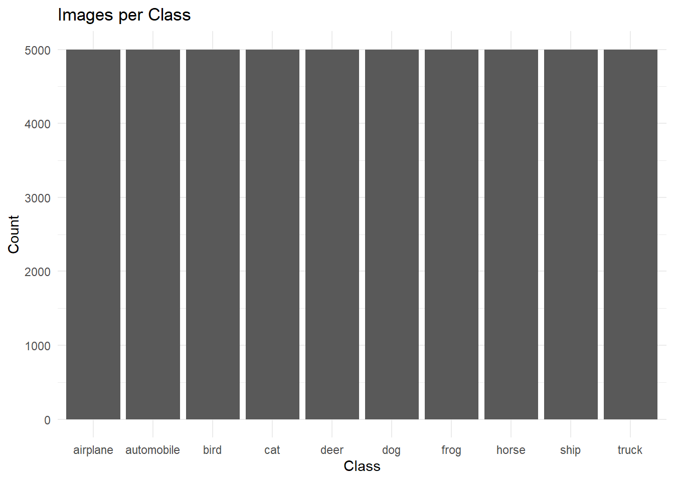
# This assignment asks that students analyze a complex dataset. To this end, I will be analyzing the CIFAR-10 image dataset, which consists of 60,000 color images. 

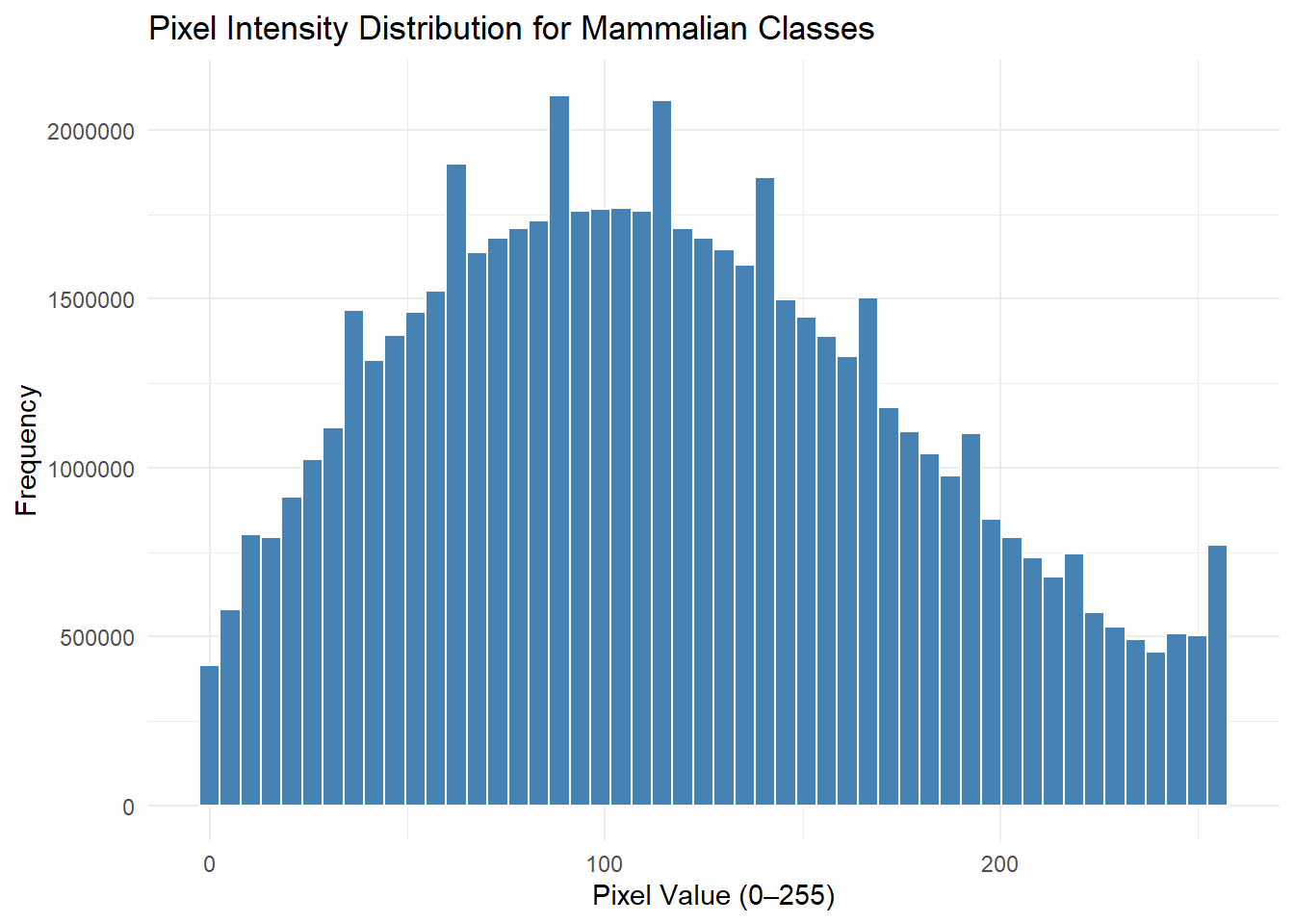
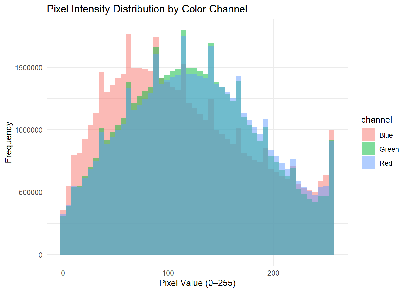
# The CTEGD Cytometry Shared Resource Laboratory at the University of Georgia has a number of instruments -- one such instrument being the Cytek Amnis Imagestream Mk II Imaging Flow Cytometer. I have used this instrument in the past and needed to explore pixel intensity distributions to analyze the data I obtained; this was my motivation for analyzing this dataset for this assignment. 

# Install packages. Script below. 
# install.packages("keras3", "dplyr", "ggplot2")

# Load libraries. 
library("tidyverse")
── Attaching core tidyverse packages ──────────────────────── tidyverse 2.0.0 ──
✔ dplyr     1.1.4     ✔ readr     2.1.6
✔ forcats   1.0.1     ✔ stringr   1.6.0
✔ ggplot2   4.0.1     ✔ tibble    3.3.1
✔ lubridate 1.9.4     ✔ tidyr     1.3.2
✔ purrr     1.2.1     
── Conflicts ────────────────────────────────────────── tidyverse_conflicts() ──
✖ dplyr::filter() masks stats::filter()
✖ dplyr::lag()    masks stats::lag()
ℹ Use the conflicted package (<http://conflicted.r-lib.org/>) to force all conflicts to become errors
library("keras3")
library("dplyr")
library("ggplot2")
# Load the CIFAR-10 dataset.
cifar <- dataset_cifar10()
# The CIFAR-10 dataset comes with 50,000 training images and 10,000 test images. We will train and test the dataset.

train_images <- cifar$train$x
train_labels <- cifar$train$y
test_images  <- cifar$test$x
test_labels  <- cifar$test$y 
# Inspect the structure of the data. 
dim(train_images)
[1] 50000    32    32     3
str(train_images)
 int [1:50000, 1:32, 1:32, 1:3] 59 154 255 28 170 159 164 28 134 125 ...
# The output tells us that the training data has the following dimensions: 50000 x 32 x 32 x 3. This means there are 50,000 images, where each image is 32 x 32 pixels. Each pixel has three intensity values (Red, Green, Blue). 
# This dataset consists of 10 classes: airplane, automobile, bird, cat, deer, dog, frog, horse, ship, and truck. The labels are stored at numbers instead of words. Let's assign words to  numeric label. 

class_names <- c(
  "airplane","automobile","bird","cat","deer",
  "dog","frog","horse","ship","truck"
)
# I want to see how many images there are per class. To do this, I will first create a data frame of labels.

label_df <- data.frame(label = train_labels[,1])

# CIFAR-10 labels are a matrix with one column. [,1] is a syntax that will enable me to extract the first column of a matrix while retaining all rows, essentially converting the data from a matrix into a vector I can use for downstream analysis.
# I will now convert the numeric labels into class names.
label_df$class <- factor(label_df$label,
                         levels = 0:9,
                         labels = class_names)
# Examine the data.
str(label_df)
'data.frame':   50000 obs. of  2 variables:
 $ label: int  6 9 9 4 1 1 2 7 8 3 ...
 $ class: Factor w/ 10 levels "airplane","automobile",..: 7 10 10 5 2 2 3 8 9 4 ...
summary(label_df)
     label            class      
 Min.   :0.0   airplane  : 5000  
 1st Qu.:2.0   automobile: 5000  
 Median :4.5   bird      : 5000  
 Mean   :4.5   cat       : 5000  
 3rd Qu.:7.0   deer      : 5000  
 Max.   :9.0   dog       : 5000  
               (Other)   :20000  
# I confirmed that the classes have been assigned class names. I can also see that there are 5,000 images per class. I want to visualize this. 

ggplot(label_df, aes(x = class)) +
  geom_bar() +
  theme_minimal() +
  labs(title="Images per Class",
       x="Class", y="Count")

# Subset the data to selected classes. To this end, I will work with images of mammals (cat, dog, horse, deer).

animal_classes <- c("cat", "dog", "horse", "deer")

animal_idx <- label_df$class %in% animal_classes
# Create a new object with only animal images. 
animal_images <- train_images[animal_idx,,,]
animal_labels <- label_df[animal_idx,]
# Explore the data.
str(animal_labels)
'data.frame':   20000 obs. of  2 variables:
 $ label: int  4 7 3 4 7 7 3 4 3 3 ...
 $ class: Factor w/ 10 levels "airplane","automobile",..: 5 8 4 5 8 8 4 5 4 4 ...
summary(animal_labels$class)
  airplane automobile       bird        cat       deer        dog       frog 
         0          0          0       5000       5000       5000          0 
     horse       ship      truck 
      5000          0          0 
# Examine the pixel intensity distribution for mammalian classes. To do this, all pixel values from the mammalian images must be converted into a single vector. 

animal_pixels <- as.vector(animal_images)
# Explore the data.
str(animal_pixels)
 int [1:61440000] 28 28 125 53 142 164 110 153 252 131 ...
summary(animal_pixels)
   Min. 1st Qu.  Median    Mean 3rd Qu.    Max. 
    0.0    67.0   112.0   116.1   160.0   255.0 
# Pixel intensity values range from 0 to 255. Most of the data is in the mid range (112.0), meaning that the images are not too dark (0) or too bright (255). 
# Now, plot the distribution of pixel intensity values for images of mammals. 

ggplot(data.frame(pixel = animal_pixels), aes(x = pixel)) +
  geom_histogram(bins = 50, fill = "steelblue", color = "white") +
  theme_minimal() +
  labs(
    title = "Pixel Intensity Distribution for Mammalian Classes",
    x = "Pixel Value (0–255)",
    y = "Frequency"
  )

# As mentioned earlier, there are three intensity values per pixel (red, green, blue). We can compare pixel intensity by color channel. 

# Extract the color channels. 
red   <- as.vector(train_images[,,,1])
green <- as.vector(train_images[,,,2])
blue  <- as.vector(train_images[,,,3])

# Combine the channels into one data frame. 
pixel_df <- data.frame(
  value = c(red, green, blue),
  channel = factor(rep(c("Red", "Green", "Blue"),
                       each = length(red)))
)
# Plot the distributions. 
ggplot(pixel_df, aes(x = value, fill = channel)) +
  geom_histogram(bins = 50, alpha = 0.5, position = "identity") +
  theme_minimal() +
  labs(title = "Pixel Intensity Distribution by Color Channel",
       x = "Pixel Value (0–255)",
       y = "Frequency")

# We can also explore the mean brightness (average pixel value) and contrast (standard deviation of pixel values) for this subset of images. 

# Determine mean brightness per image. 
mean_brightness <- apply(animal_images, 1, mean)

# Determine contrast per image. 
contrast <- apply(animal_images, 1, sd)

# Combine into a new data frame. 
image_features <- data.frame(
  class = animal_labels$class,
  brightness = mean_brightness,
  contrast = contrast
)
# Explore the data. 
str(image_features)
'data.frame':   20000 obs. of  3 variables:
 $ class     : Factor w/ 10 levels "airplane","automobile",..: 5 8 4 5 8 8 4 5 4 4 ...
 $ brightness: num  80.2 121.7 70.5 73.8 141.1 ...
 $ contrast  : num  36.5 59.4 57.3 18.5 67.3 ...
summary(image_features)
        class        brightness        contrast     
 cat       :5000   Min.   : 15.29   Min.   : 11.41  
 deer      :5000   1st Qu.: 96.96   1st Qu.: 43.36  
 dog       :5000   Median :115.42   Median : 52.55  
 horse     :5000   Mean   :116.07   Mean   : 53.18  
 airplane  :   0   3rd Qu.:133.23   3rd Qu.: 62.36  
 automobile:   0   Max.   :235.11   Max.   :109.58  
 (Other)   :   0                                    
# Plot brightness vs. contrast. 

ggplot(image_features,
       aes(x = brightness, y = contrast, color = class)) +
  geom_point(alpha = 0.4) +
  theme_minimal() +
  labs(title = "Brightness vs Contrast in Animal Images",
       x = "Mean Brightness",
       y = "Contrast")

# We can also predict contrast from brightness, and vice versa. To do this, I will work with a subset of the data (restrict data to images of cats only). 

cat_data <- image_features[image_features$class == "cat", ]

# Explore the data.
str(cat_data)
'data.frame':   5000 obs. of  3 variables:
 $ class     : Factor w/ 10 levels "airplane","automobile",..: 4 4 4 4 4 4 4 4 4 4 ...
 $ brightness: num  70.5 88.9 104 83.7 120.3 ...
 $ contrast  : num  57.3 45.1 92.5 47.4 50.8 ...
summary(cat_data)
        class        brightness        contrast     
 cat       :5000   Min.   : 18.58   Min.   : 11.41  
 airplane  :   0   1st Qu.: 94.13   1st Qu.: 45.61  
 automobile:   0   Median :115.08   Median : 54.67  
 bird      :   0   Mean   :116.23   Mean   : 55.31  
 deer      :   0   3rd Qu.:134.95   3rd Qu.: 64.31  
 dog       :   0   Max.   :231.28   Max.   :109.58  
 (Other)   :   0                                    
# Predict contrast from brightness. 
fit1 <- lm(contrast ~ brightness, data = cat_data)
summary(fit1)

Call:
lm(formula = contrast ~ brightness, data = cat_data)

Residuals:
    Min      1Q  Median      3Q     Max 
-39.396  -9.650  -0.360   8.789  51.806 

Coefficients:
             Estimate Std. Error t value Pr(>|t|)    
(Intercept) 47.055499   0.708388   66.43   <2e-16 ***
brightness   0.070978   0.005866   12.10   <2e-16 ***
---
Signif. codes:  0 '***' 0.001 '**' 0.01 '*' 0.05 '.' 0.1 ' ' 1

Residual standard error: 13.59 on 4998 degrees of freedom
Multiple R-squared:  0.02846,   Adjusted R-squared:  0.02827 
F-statistic: 146.4 on 1 and 4998 DF,  p-value: < 2.2e-16
# Predict brightness from contrast. 
fit2 <- lm(brightness ~ contrast, data = cat_data)
summary(fit2)

Call:
lm(formula = brightness ~ contrast, data = cat_data)

Residuals:
    Min      1Q  Median      3Q     Max 
-88.579 -22.407  -1.639  19.118 121.342 

Coefficients:
            Estimate Std. Error t value Pr(>|t|)    
(Intercept) 94.05631    1.88877    49.8   <2e-16 ***
contrast     0.40096    0.03314    12.1   <2e-16 ***
---
Signif. codes:  0 '***' 0.001 '**' 0.01 '*' 0.05 '.' 0.1 ' ' 1

Residual standard error: 32.3 on 4998 degrees of freedom
Multiple R-squared:  0.02846,   Adjusted R-squared:  0.02827 
F-statistic: 146.4 on 1 and 4998 DF,  p-value: < 2.2e-16
# The results show that brightness and contrast are negatively related.